Nostalgia is Fleeting

Nostalgia is Fleeting

     Nostalgia can be tainted. There is a struggle to balance then and now. Oftentimes, we look back at once seemed to be simple pleasures, but are now iconic. We will look back 20 years from now, or even less, and reach for nostalgia. Is it an escape from the present, or is it pushing against the negative past and putting pleasures of the time on a pedestal? 

     When I was younger, I believed the world used to be black and white, and at some point in time, the world turned color. With no familiarity of the world before, only the current moment seemed to have color. Then, the world was overly saturated, in your face with neons, brightly colored toys, candies, magazines, marketing. At some point, we look back and feel dullness in the present. The world seems to lose color. 

     Nostalgia is a look in the past to bring color to the present, but in time, we'll seem to long for this current moment. Color always exists. Good memories, even in the bad exist and can be found. The past is no better than the present. 

     Find Color.

Annaliese Sylvester

@annaliesesylvester | annalieseart.com

Dear Tooth Fairy

Dear Tooth Fairy

Our piece is a recollection of the childhood excitement over the tooth fairy. 

We made this piece as a family because it was a joyous part of raising our children and we wanted to share with viewers the fantasy and innocence of this experience. 

Cara, John & Maya Vaughn

@Caralina_creates | @dangerous_cherub

The Candy Parlor

The Candy Parlor

“The Candy Parlor, a tribute by Miko Beach to his late father, draws inspiration from shared moments of movie-watching and candy indulgence. Nostalgia takes center stage as Miko incorporates a vintage 90s TV and VCR, creating a space that feels like a personal sanctuary for his dad. The blend of colorful elements with dark undertones evokes a captivating fusion of gothic and Candyland aesthetics. Painted canvases of cherished candies, adhesive sprinkles, and hand-painted pink, candy-like text add a unique touch. Stepping in evokes a sense of returning to the magic of cherished childhood memories.”

Miko Beach

No Bitter Without The Sweet; No Sweet Without The Bitter

No Bitter Without The Sweet; No Sweet Without The Bitter

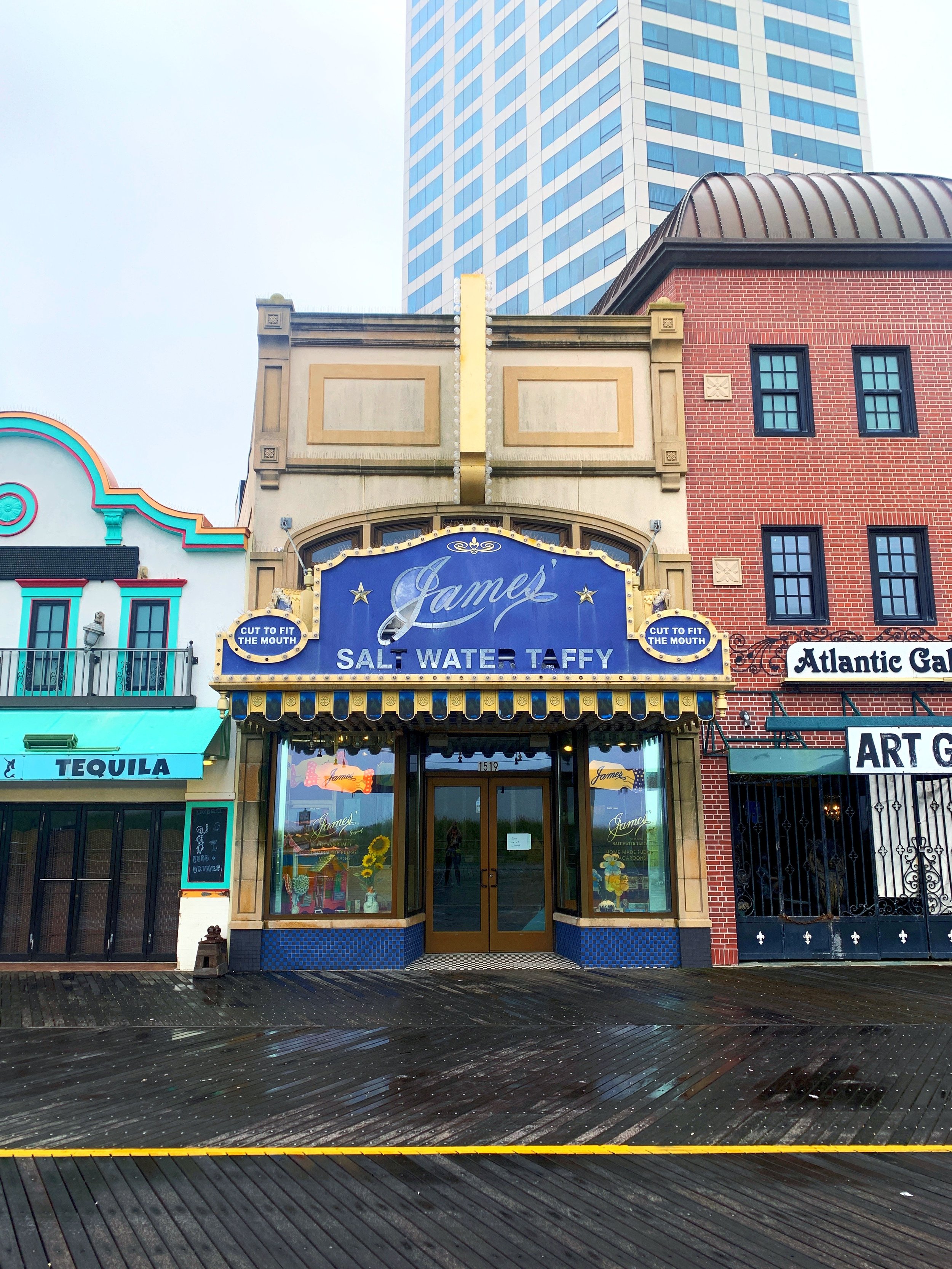
"Bitter/Sweet" is my art installation created for "ARTeriors at The James" and inspired by the former James Candy Company on the iconic Atlantic City Boardwalk. The concept explores the duality of two opposing forces in an immersive experience featuring found and repurposed confectionery materials. The aesthetic is a push and pull between the bold/expressive BITTER and the soft/ethereal SWEET.

As you move through the space, I invite you to notice the found materials that have been given a second life, such as...

“Wall paper” made from store wrapping paper; 
Wicker chairs revamped into my version of “peacock chairs”
Baker’s racks used as “moveable frames” for cellophane paintings;
Metal sheet pans now “canvases” for the portrait paintings;
James candy sign turned into a “stencil” for floor painting;
Candy box “mobiles” suspended from the ceiling.

In creating this space, I’ve pushed outside my boundaries to explore new materials, process, application, and unique ways of visual storytelling.

Allowing yourself to consider… where SWEET and BITTER converge.

Chanelle René

@beingchanellerene | chanellerene.com

Chanelle René is an award-winning, New Jersey contemporary figurative painter and mural artist. Her use of vibrant colors and painterly brushstrokes in oils and mixed media often celebrate the feminine figure to create narrative and engaging works from original canvases to large-scale murals. Chanelle has exhibited nationally and internationally with works held in private and public collections. A self-taught artist, she embraced the ‘pandemic pause’ to transition from a 20+ year career in digital marketing to become a full-time artist. A true believer that anyone can ‘shine your vibe’ at any stage of life, Chanelle’s artwork embodies endless possibilities.

Butter Mint

Butter Mint

Since Atlantic City is the birthplace of the saltwater taffy, I decided to incorporate the most familiar color that comes to mind for me when I think about saltwater taffys stemming back to when I was a child which is the teal green colored candies. I used three different hues of this color to create the composition in the center of my installation. The outside sculptural border I chose to use the color white inspired by sea foam which was left over in David Bradley’s store on the boardwalk that was left soaking into taffys on the floor caused by a flood that was sold to a child as a joke and created the very first saltwater taffy.

Anthony ( Seper ) Torcasio

I found a flower at my feet

I found a flower at my feet

Within the confines of a warehouse space shrouded in tarps, an installation emerges, a testament to the resilience of nature and the potential for human action. A short film, captured through a child-like, first-person perspective, unfolds upon a pristine expanse of recycled seamless paper, inviting viewers to embark on a journey of discovery amidst the wonders of nature. The film's raw, handheld aesthetic, reminiscent of a childhood exploration, mirrors the unfiltered essence of human interaction with the natural world.

The projector, perched atop a weathered commercial baking rack, serves as an anchor for the installation, its worn surface reflecting the passage of time and the challenges we face. The rack, covered in dust and plastic, symbolizes the remnants of our past consumption and the need for transformation. A plastic flowering vine adorns the rack, adding a touch of artificial vitality to the scene, hinting at the potential for renewal amidst decay.

The installation's location at the back of the warehouse, tucked away beneath the tarps, underscores the delicate balance between our exploitation of nature and the need for preservation. The tarps, like a veil over the installation, create a sense of secrecy and anticipation, inviting viewers to delve into the hidden depths of our relationship with the natural world. The use of a DVD player and a projector call out the increasing speed at which technology becomes obsolete.

As viewers navigate this immersive experience, they are confronted with the paradox of our existence: our dependence on nature for sustenance and inspiration versus our relentless exploitation and destruction of its resources. The recycled seamless paper, a product of consumption and waste, serves as a stark reminder of our unsustainable practices and the need for radical change.

The weathered baking rack, the plastic flowering vine, and the hidden location within the warehouse all contribute to the installation's overall atmosphere of rawness and authenticity. They reflect the imperfections of nature and the challenges we face in our relationship with it.

Yet, amidst this rawness, there is also a glimmer of hope. The film's exploration of nature's resilience and the ambient soundscape's gentle melodies suggest that we can find a way to coexist harmoniously with the natural world. The installation serves as a call to action, urging us to move beyond mere awareness and towards meaningful action.

Lucy Sanchez

@iamluzkarolina | @lukchez | luzkarolina.com